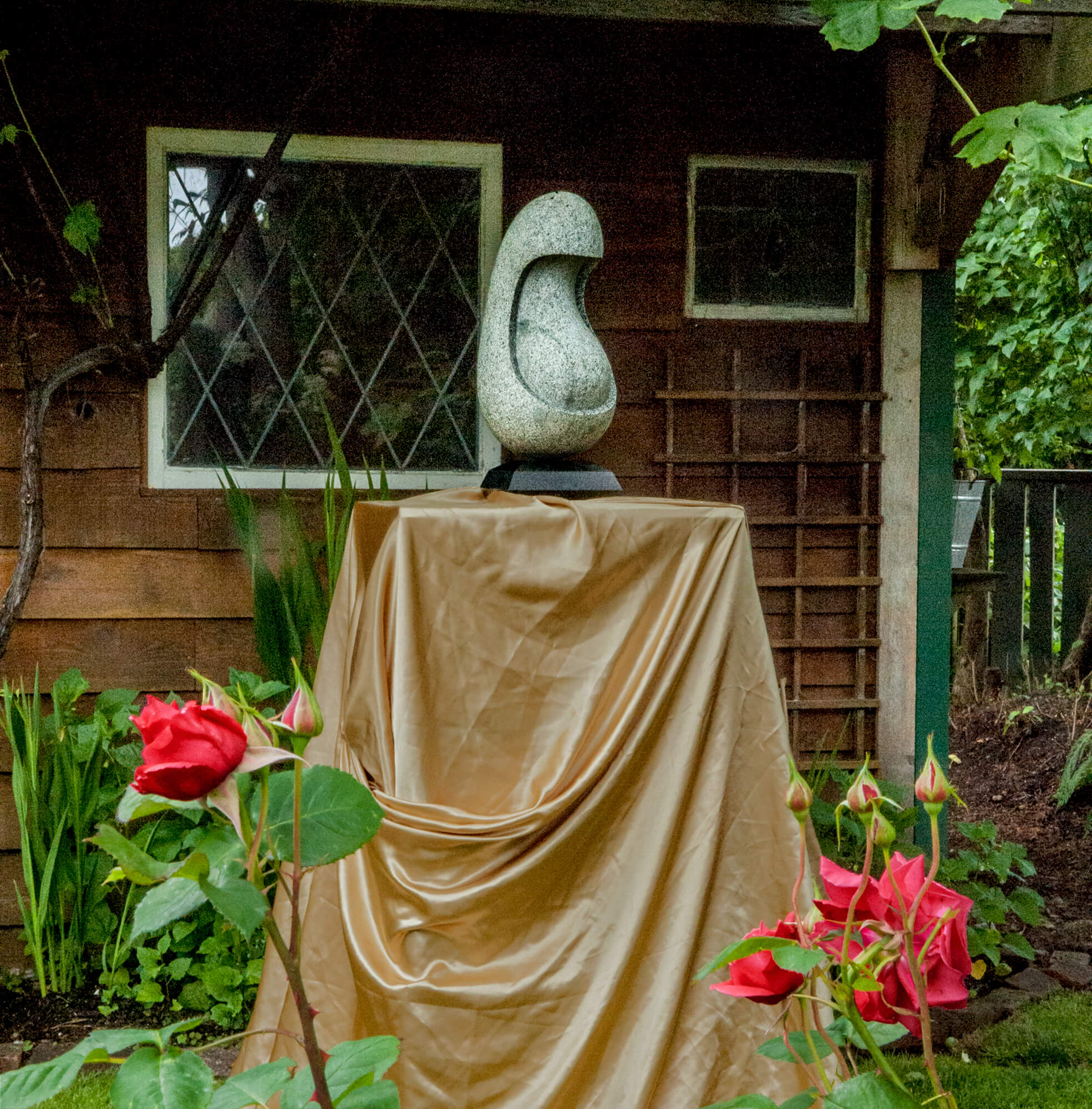
I took several years to decide which way was up on this granite boulder.
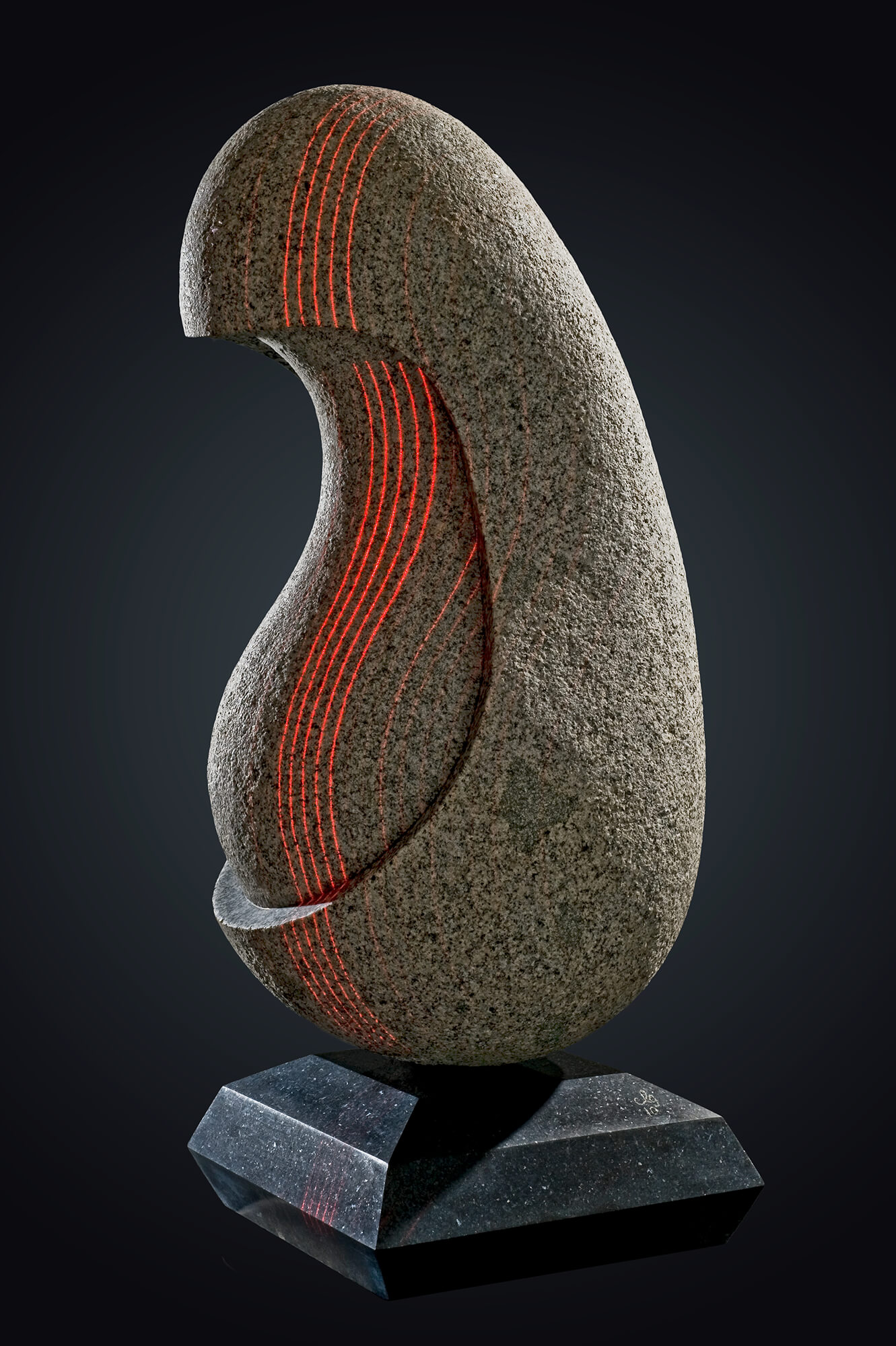
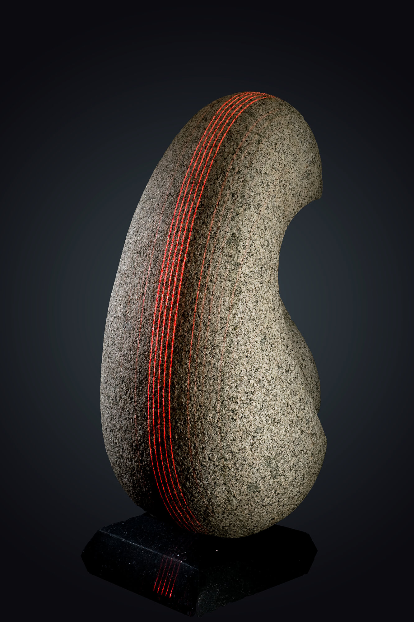
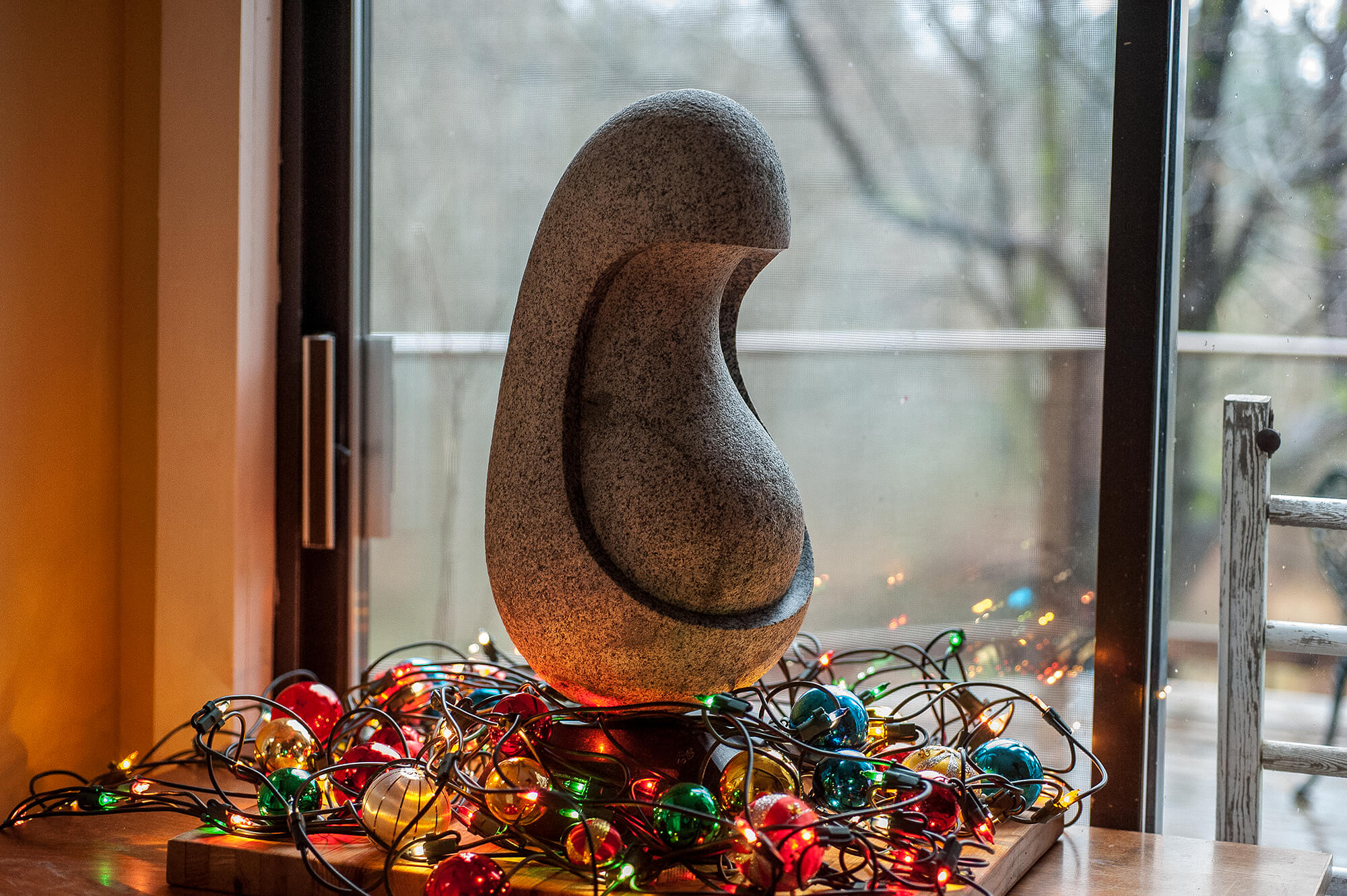
I took the easy way out by putting the heavy end down, and now the sculpture balances, spins like a top on its black granite base, and is stable perceptually – – it rests. It reminds me of the head and body of a madonna, probably pregnant. Upside down, the sculpture looks like the same madonna and the neck would be the neck in both versions. But the figure extends to the hips now. Upside down, it would have reached only to the bottom of the madonna’s cowl. The boulder also balances almost perfectly on its back, and it even spins. That way, it reminds me of a baby.
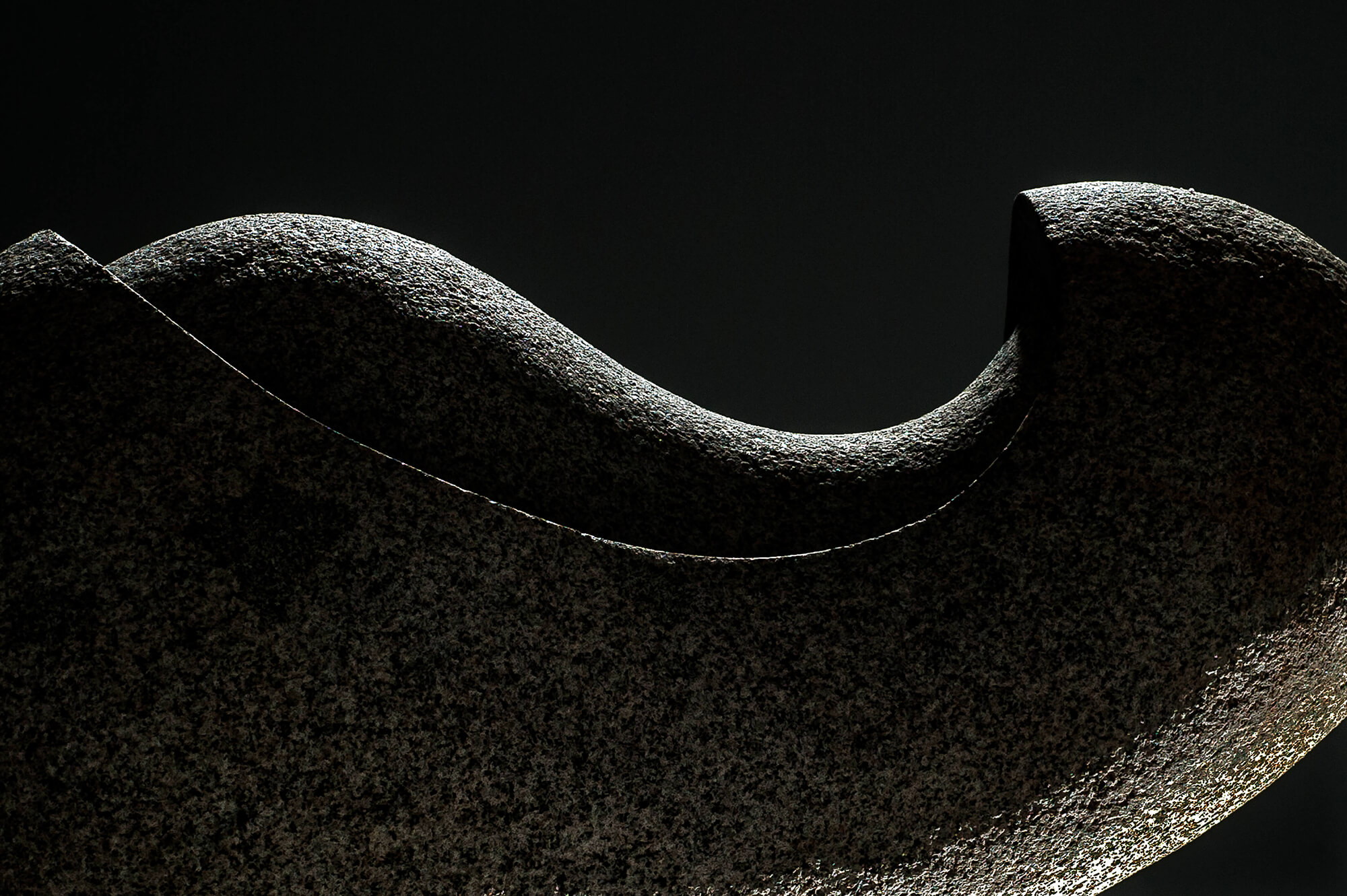
The Granite Madonna and its base contrast strongly in form, colour, and texture. I had worked with only two surfaces in other sculptures, and wanted to see what three could do. The madonna is simple. She has only three curved surfaces, two parallel curved intersections between them, no points, and nothing else at all but texture. The base has many more components than the madonna, but its components are simpler. It has 13 flat planes, 28 straight lines, and 16 points, arranged in simple, starkly geometric ways that contrast with the smoothly curving sculpture it supports.
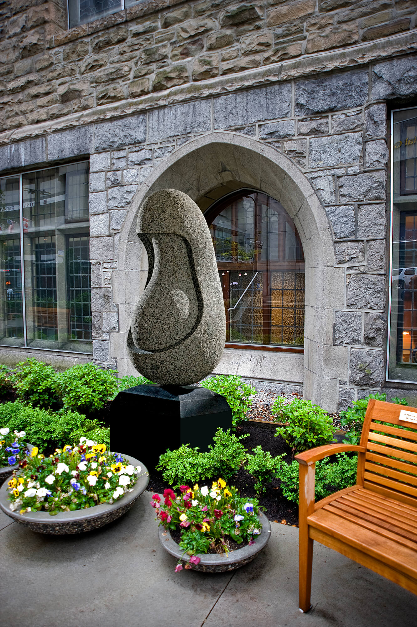
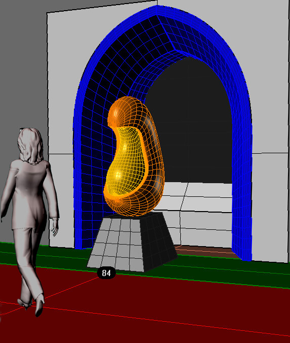
The two images of enlarged versions are from an unsuccessful proposal to Christchurch Cathedral in Vancouver for a pocket garden along Burrard Street.
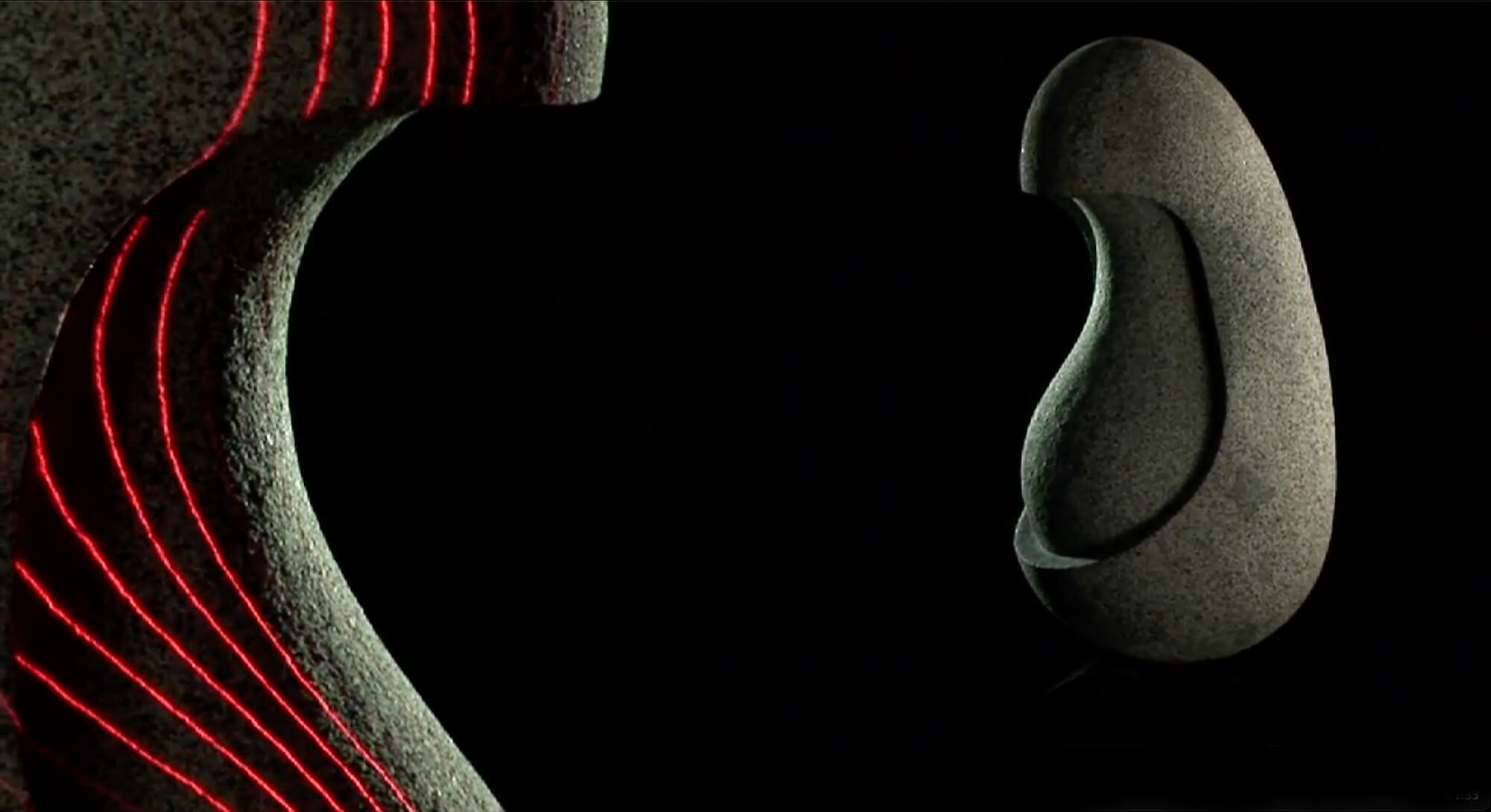
See Mark Wunsch’s beautiful video, The Granite Madonna.
Here is an animated 3D model of The Granite Madonna. Photos and model by Lee Gass. Rhino animation scripts by Bill Meyers.
Granite Madonna Rhino 1


