
Computer model
of Heart of Anima. This is a 3D
graph with its front faces removed to
reveal internal structure. Model
and sculpture by Lee Gass.
Gail Lotenberg,
choreographer and director of
Experiments, a dance production expressing
the essence of scientific creativity, suggested that
I mount a sculpture exhibition during our performances.
There was room for only one actual sculpture, so we
agreed that in addition to an exhibition of photos
of my work, The Granite Madonna would
rotate in a field of laser light at the
end of a long mirror.
Gail wanted me
to represent two things from
her video interview with me as posters
in the photo exhibit. My descriptions of the
movements involved in carving stone remind-
ed her of dancing, and as dancer and cho-
reographer, she resonated with my
thoughts about sculpting.
With that in mind,
she asked me to create the
poster on movement I wrote
about in On Moving
Forms Into
Being.
She also found
what I said about graphs and
graphing interesting from a choreographic
perspective, especially 3D graphs that move.
With the idea that graphing connects science
and sculpting in mind, she asked for a
poster on graphing as well, and
that’s what I write about
here.
♦
Gail Lotenberg is
a professional choreographer.
Before that, as this video preview of
Experiments shows, she was good at math
and science in school. They are still in her
mind, still in her bones, and still in her
dance and choreography. And as
she and I know, scientists can’t
live without graphs or
graphing.
♥
Everyone knows
that pictures are worth thousands
of words. Any kid can tell you that. To a
scientist, graphs can be worth thousands of
pictures. It could take that many pictures just
to make a graph, and that many more
to interpret it!
They describe
complex relationships with few
words and fewer pictures. They keep
Big Pictures and Details clearly in mind,
and help us communicate more
deeply than without them.
Really good graphs
say what we’re about to say
before we say it, so to speak. Some-
times, one look at a graph and we don’t
even need words to get the picture.
The graph is the picture and
we get it. Just like that.
We still
need details, and graphs
help with that as well. But
with Big Pictures
clearly in mind,
little pictures
are easier
to get
AND
little pictures
help us see the
big ones.
That’s what a graph can do.
It’s what
makes pictures worth thousands
of words and graphs worth thousands
of pictures. What a lot of
words to save!
The point of
all this is that graphs illus-
trate relationships that might not be
clear just from looking directly
at data or reading many
words.
The first thing
students need to learn to see
in graphs is what I call The Big Picture.
Does the line go up, down, or sideways? Is
it straight or curved, concave-up, convex-up?
If something changes over time, does it speed
up, slow down or reach a steady state?
Humps, bumps, and features
like that.
Big Pictures are
easy to see. Anyone can see
them. Everyone must see them to
understand details. The shapes of curves
make all the difference, as do the shapes of
surfaces in 3D graphs. A simple example
of a 3D graph that moves is this video
of the South African flag waving
in a steady breeze.
Someone
programmed a computer
to make a surface wave up and down in a
wave pattern. Waves of a certain height, with a
certain spacing of crests and troughs, moving across the
surface at cerain speed and direction. The program
coloured and lighted this surface in certain
ways and displayed it from a
certain perspective.
Coloured and lighted
like that, the graph represents
a South African flag waving in a breeze.
With different details, the same graph could
represent the surface of a pond with
waterstriders striding on it:
Walking on Water.
Even if all you had
was one static snapshot from a
moment in time, a graph like this would
still shows the size, spacing, and axis of
movement of the waves. With the
movement in the video, the
graph shows more.
A long, thin
graph might show
the density of drivers on a
certain stretch of freeway, moving
at certain speeds over certain periods
of time. It could display real data
about real cars or output of
models of driver
behaviour.
It could
be sound waves, vibrating
windowpanes, drumheads, eardrums.
Anything, really, with wavelike behaviour
that varies spatially and/or
changes over time.
The only thing
that makes the graph of a flag
a flag is that somebody
made it that way.
Another kind of graph is this one about
hummingbirds that illustrates
A Story for Twyla Bella.

The graph tells
the following short story:
“An adult female
rufous hummingbird sat on
a perch at three different air
temperatures within
one hour.”
This result was
part of the work of my first
undergraduate research student at UBC,
Bob Purdy. The hummingbirds’ responses to
temperature, as shown by the shapes and sizes
of their silhouettes, were remarkably uniform,
both within and among individuals. With
the colours I added, Bob’s graph is easy
to understand even without numbers.
When it’s cold,
hummingbirds are a different
shape, are bigger, and perch
with different posture
than when they’re
warm.
Big Pictures
are made of details, and
they display details magnificently,
but they’re not as much about details
as about how details relate to other
details, and how those relation-
ships make a whole. Graphs
are great for that.
I could go on
forever about graphing
in science, but I need you
to see how it relates to
sculpting.
Here are
a graph and a photograph
of my basalt sculpture Heart of Anima.
The graph displays real measurements
of the surface of the sculpture. The
sculpture displays the rock
I carved it from.

In this rendering
of the model, I displayed the
convex and concave surfaces of the
sculpture differently. Dark, softly lit,
matte concavities with curves. Polished
gold convexities reflecting a city-
scape in broad daylight.
As if those
concavities were warped
sheets of graph paper, their
isolines, or meridians,
define them.
Netting emphasizes form.

Here, the web
is on convexities and concavities
aren’t there. I made them invisible so
I could “see” what I was planning
to do inside the sculpture.
These ways to
graph surfaces emphasize
different things, and inform
me differently about what
I’ve done and what
I need to do.
Bobbles in
reflected cities reveal bobbles
in the mirrors that reflect them, whether
those mirrors are the polished surfaces
of real stone or metal sculptures or
graphs of those surfaces in
a computer.
On broad surfaces
of the model, where its curvature
is low, the quality of its reflections is high
and it is accurate. Near the upper and lower
points of the piece, where the accuracy
of measurements make more difference,
the model surface reflects those
errors, which is obvious
in the image.
Except for those
two problem areas and one on
the back, careful measurement showed the
model to be accurate to about a millimeter
everywhere else. That was accurate
enough for what I needed,
so I continued.
In case you’re
wondering, those same parts
of the stone sculpture itself
show none of those
irregularities.

Back in the
beginning, while Heart
of Anima was still just a rock in
my stoneyard, I admired it for years,
wondering what to make of it. Some-
thing about the shape of the stone
kept grabbing my eye
and imagina-
tion.
I just
simplified
that something
and made it
real.
It wasn’t very
creative of me to let a rock
tell me what to carve like that, but I
was fine with that. In terms of graphing,
what mattered most was that as I ate
into the stone I found a system
of very fine cracks.
There were
only a few of them, but
the deeper I carved the more
I feared for one of the most
beautiful stones I had
ever seen.
I worried a lot about it.
To stabilize the
boulder and hold it together,
I needed to insert long steel pins to tie
the sides of each crack together and
prevent the sculpture from
falling apart.
Pins had to
cross all cracks, not touch each
other, not touch the long central mounting pin
or its sleeve, and no pin could break the
surface of the stone. They had
to be invisible.
But where
did each crack go beneath the
surface and how could I pin it? There’s
not much room for steel in a rock that size,
so I needed a good plan for the holes for
the pins and the only way I could
think of to work all that
out was with
a model.
Using Microscribe, a
mechanical 3D digitizer I’ve had
for many years, I built a 3D computer
model of my sculpture, a graph,
late in its development.
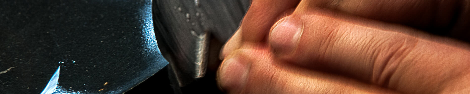
In the image
below, you look past the hip
of the real sculpture on your right
to the model of the sculpture on my
computer screen. The sculpture
and the model are at slight-
ly different angles of
rotation.

Here is
how I made the model.
On the surface of the
real sculpture, I drew a net of meridians
with coloured pencils & digitized points along those
lines. Then I ran smooth curves through the points
and lofted smooth surfaces over that network
of curves. Four independent, inter-
secting surfaces.
When I was
satisfied with the accuracy
of the model, I digitized points along
the cracks where they broke the
surface and studied
them.
To my delight,
each crack turned out to be a
flat plane! That greatly simplified my
challenge. I could extend what I called
“crack planes” through the model
stone that sliced it into various
sizes and shapes of
model pieces.
Studying crack
planes revealed what the pins
must accomplish. I installed 6 long
and 1 short pin through only 5
holes in the surface of
the stone.

In addition to
the convex surfaces and their
isolines, this rendering displays a vertical,
orange, 5/8″ mounting pin and two blue
8″ x 1/4″ steel pins running through
the invisible inside of the
stone.
If I had
shown all of the pins,
you would get the point that
I had to plan the holes carefully.
I could never have done anything
so precise without the aid
of a model.
That might seem
too technical and scientific for
art, but I don’t apologize for that.
I am a scientist as well as an artist,
after all, and model-building
was all I could think of to
solve the problem.
I’ve used
computer models of sculptures
in several other ways as well, including the
large basalt sculpture Girlchild Reflected in
Her Mother’s Eye, outside the
Microbiology Building
at UBC.

The fundamental
design of Girlchild is ridiculously
simple: two large spheres with
a spherical bite out of one
of them.
With limited budget
and time, I experimented with
the model to see how to maximize
the visual power of the sculpture
and minimize the carving
I had to do.
I could have
experimented with clay.
But working with the model
was faster and more accurate. I
could save as many versions as I
wanted and compare them.
The plan of
action was simple: digitize
the basalt column and the spheres,
adjust the spheres in relation to
each other and the column
until I liked it, then
carve it.
♦
Another example is
The Granite Madonna. I didn’t
need a model of the sculpture itself,
but I wanted to design a base of
jet black granite.
Instead of buying
a circular base or cutting a
rectangle from a granite headstone,
I wanted to carve a big, black, sharp-edged
crystal to contrast with the smoothly curving,
light coloured sculpture above it. But how
big? How many facets? What
kind of geometry?
Would reflections
from sloping flat surfaces
distract viewers? With a computer
model, I could try ideas ideas out
before spending several days
making the base.

Everywhere
on the model sculpture, here,
is brushed gold with laser lines of three
different colours on the three surfaces. That
helped me visualize those surfaces in re-
lation to each other and to the
faceted base beneath it.
Digitizing the
sculpture and constructing the
model took a while. But once I had the
model I hacked out base after base under it
in minutes. I threw away 15 or 20 virtual
black granite bases before I found
the one I wanted. After that,
it was simple to carve it
in stone.
I hope this
helped you see sculptures
as graphs, and see how sculptors
might use graphs in
sculpting.
The story of
Buzz Holling’s manta ray
sculptures in Heroes, Masters and Wizards:
Buzz Holling provides another example of my use
of computer models in sculpting.
Though Frank Spear
and the Pea Seeds doesn’t refer
explicitly to graphs, Frank’s hypothesis
was quite graphable, and he would have had to
graph aspects of it for me before I would get off his
back and agree that his explanation of the
phenomenon was brilliant.
The stories in
Architects of Their Own Education
are all about graphs: straight lines on
log-log graph paper expressing power laws.
Hypotheses were not about graphs or lines but
the laws they expressed. Arguments rested on
how well hypothetical power laws fit real
data. All of that was evident
in the graphs.
Walking on Water
is about high school teachers
confronting the same sorts of scientific
problems, again resting on the fit of hypo-
thetical relationships to real data, as
revealed by certain kinds of
graphs.
For a pivotal moment
in my own development as a scientist
that relates directly to graphing, see Dan
Udovic’s audio-only comment and my
reply to him at the end of the video
Grizzly Lake Story.
First published in the Vancouver Observer.
Edited March 2021
2 thoughts on “Graphing in Science and Sculpting”